Dunkin' App Redesign
Dunkin' App Redesign
Dunkin’ App
My Role: Research, UI/UX, Prototyping
Tools: Figma
Timeline: September 2023 - December 2023
Background
The Dunkin’ App is one of the leading mobile fast food/ coffee ordering apps in the App Store. This app is designed for customers who want to locate their nearest physical store location, place online orders ahead of time, and receive points and loyalty rewards, among other things. Essentially, this app exists to provide additional convenience and incentives for those who are customers of Dunkin’ Donuts.
The redesign concept that I’ve created aims to improve and add certain features to the existing app that can help create a better user experience overall. These improvements specifically include:
Changing demands: The Dunkin’ app lacks certain features that can help improve customer satisfaction and experience drastically while also making the lives of their own workers easier.
Adding a subscription concept that could help bring in more customers.
THE PROCESS
Research
To better understand the users’ needs for the Dunkin’ apps and services. It is all about researching the target audience and understanding their needs as a user of this app. Learning about their problems and needs with the current app.
Observed reviews of the current app to see user preferences, feedback, and recommendations
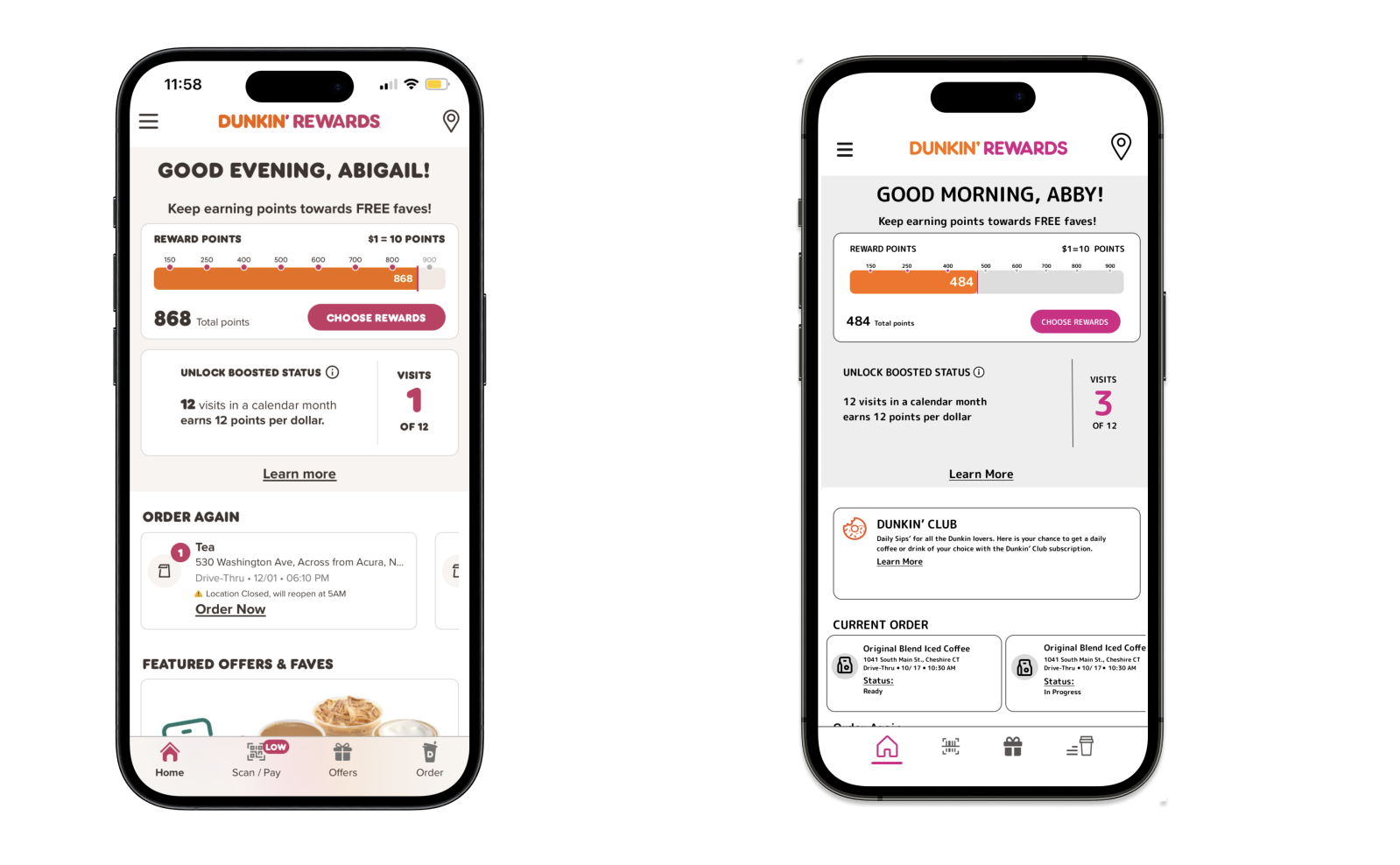
Downloaded and used the current app to get to know the app from a first-hand point of view (see screenshots below of current app design).
Objectives
Identify user problems and features with the current app.
Find solutions to fix/or improve certain features on the app.
Attempt to implement new features with the current app layout to make it easier on the user experience, while also improving and adding new features.
Challenges
Maintain the consistent look of the current app while seamlessly implementing new features.
Improve current features in an effective way.
Wireframes
The wireframing process kicked off with simple sketches, which progressed over weeks of feedback. Dedication to this process over several weeks was crucial, involving user testing and refinement to ensure optimal quality and intuitive navigation.
USER TESTING
I executed a user testing session involving five people. I provided them with instructions on how to run and use the prototype.
Likes:
Implementing the new app features seamlessly without messing up the layout of the current app.
New features were needed.
Pain Points:
Some buttons didn’t work to fully test out the app (they were unfinished)
Results from these testing’s were very helpful and led me to understand that the new features were on the right track however the app should’ve been fully finished so that the user could explore further and see how well the new feature fits in.
PROTOTYPING
Once the design was settled, it was time to delve into prototyping and fine-tuning. By undergoing a series of tests using the Figma app on an iPhone 15 Pro, I iteratively made adjustments and implemented prototypical enhancements until reaching the ultimate outcome. To the right, you'll find a video showcasing the fully designed and prototyped user flows with the new features I added.
DESIGN
Dashboard
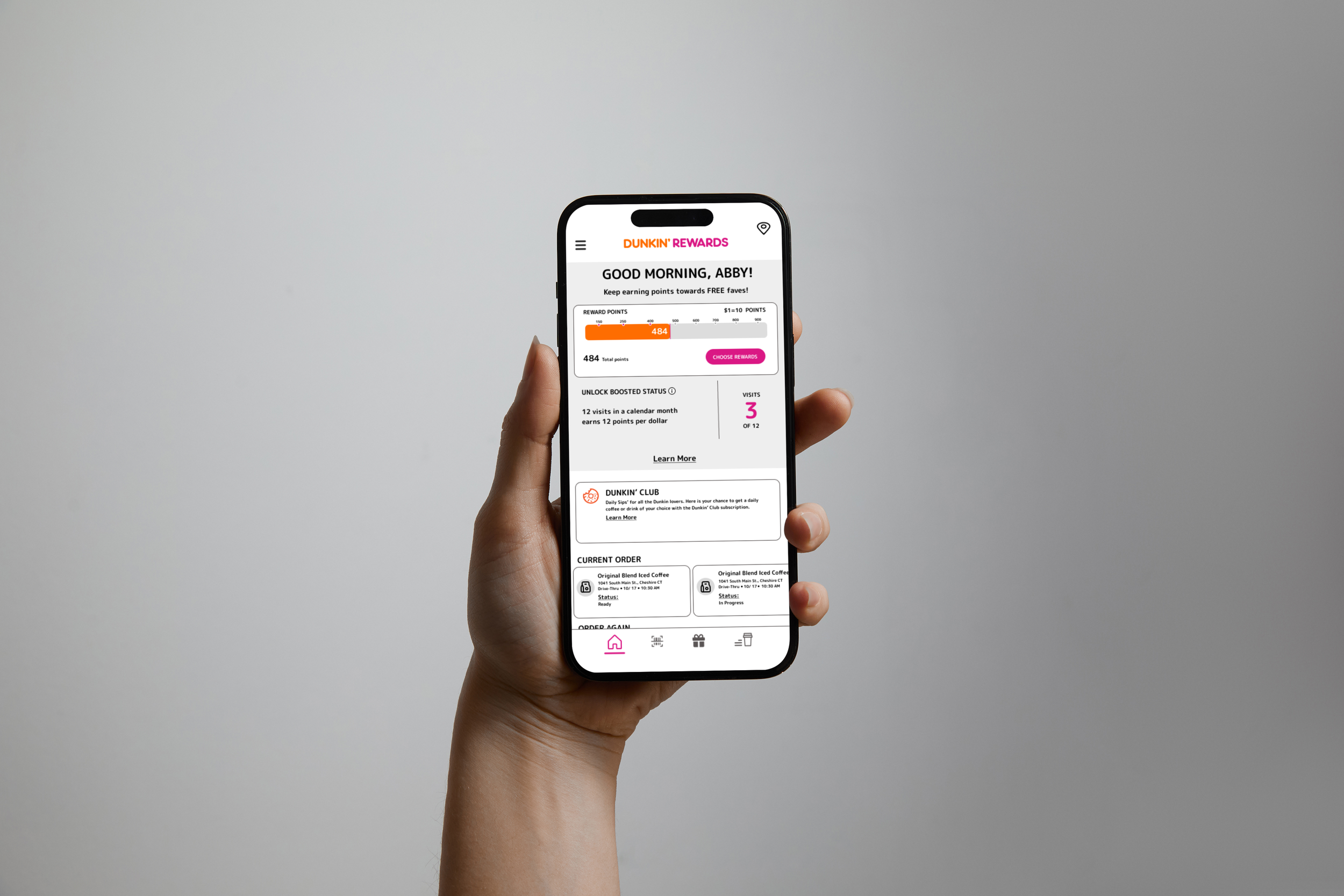
From the research that I’ve done, many users liked the layout of the current dashboard but mentioned other competitors apps had a feature where they could see the status of their order on the dashboard. So, implementing that design was something I found that many users would like to see the Dunkin’ app have.
Mobile Order
The research that I’ve done has showed that many users disliked the fact that they didn’t know when certain items were out of stock. So, when they went to the location to pick up their order it was either not made or completely missing. To fix this, I added a feature on the ordering page to mention when items are out of stock and then prompt another menu that shows suggestions to replace that item with.
Subscription
After reading and researching other companies creating subscription plans for daily customers with buying drinks. Some users liked the idea of creating a concept for a Dunkin’ coffee subscription. But, it would only be for things like coffee and teas.
Search Location Page
After researching what peoples thoughts were about the app. Many users suggested to make the location page easier to use. As much as it is very straightforward, I thought to take out certain buttons so that people aren't searching to see if certain locations are walk-in or drive-thru and instead it is right in your face to make it more obvious for users.
Current Redesign
Current Redesign
Current Redesign
Current Redesign
Conclusion
In summary, the introduction of new features to the Dunkin' app marks a strategic step forward in improving user experience, convenience, and engagement. The goal of these enhancements was to create practical and beneficial solutions for both customers and employees. Through user testing, I identified areas for improvement and refined these features accordingly. The feedback revealed that users did not require a complete app redesign but rather the addition of thoughtful new functionalities. I’m pleased with the design direction I pursued, as it focuses on addressing user needs. These updates have the potential to attract more customers to the app while ensuring orders are completed without issues caused by missing items.


